Company
Role
Responsibility
IgniteNet / Accton (Industry)
Product designer
Lead in Design Guideline and UI library development
With the introduction of a new brand visual design, our team faced a unique challenge: the coexistence of new and old brand designs in the system. Lacking a clear design logic, designers had to rely on personal judgement, leading to prolonged discussions on component usage.
This resulted in the repeated creation of components for personal use, decreasing work efficiency. Moreover, engineers were unclear about the latest designs and the logic behind component usage, causing inconsistent system UI, user confusion, and reduced work efficiency.
To tackle these issues, our design team built the design system from 0 to 1, enhancing both team collaboration and overall work efficiency.
In this project, our team successfully established a cohesive design system from scratch, implemented a strategic UI component update plan, and systematically deployed the new design system across our product. This not only enhanced our team’s internal collaboration and communication but also improved user work efficiency, showcasing the alignment of design strategy with user experience and team dynamics.
I was responsible for 2 key initiatives within the Design System project: leading the team in building Design guidelines and UI component library.
I developed a plan and execution strategy, which included inventorying design resources, setting phased goals, and facilitating internal and external design team communication. This approach ensured that the project could be progressively completed while maintaining a steady output of designs from the team.
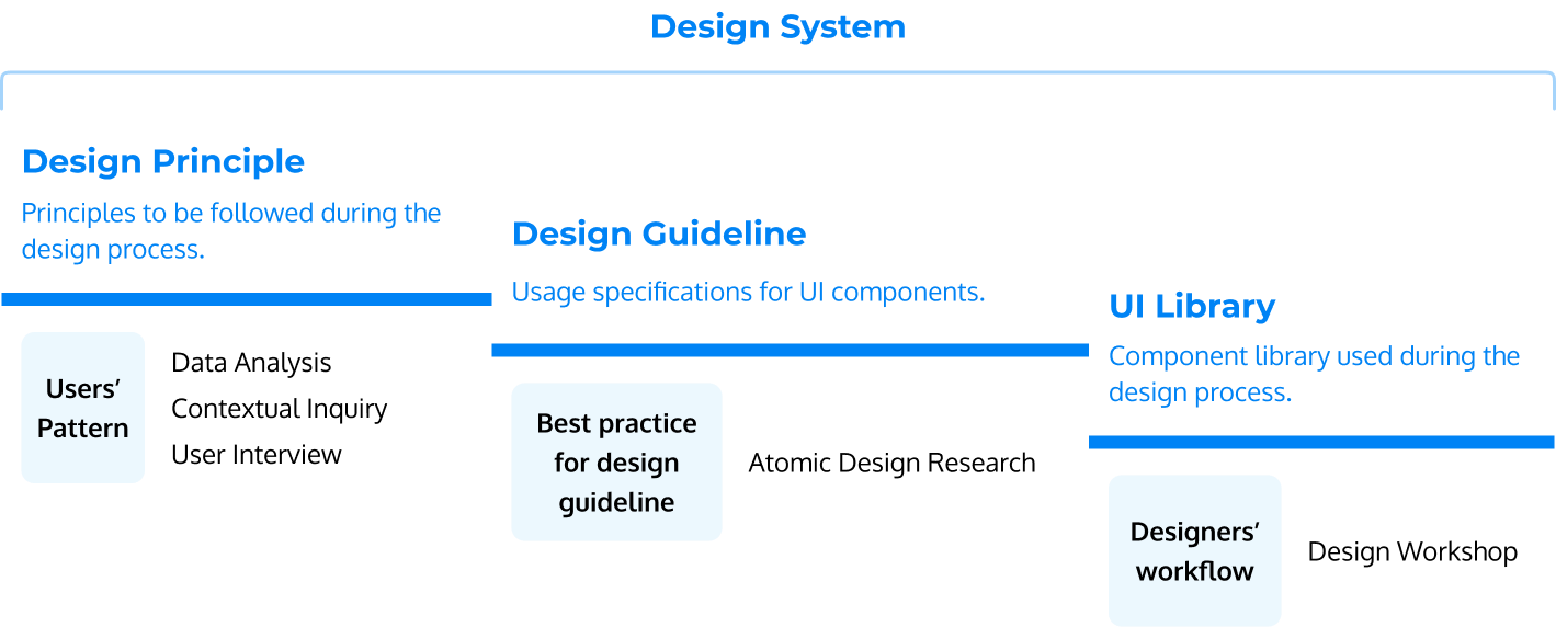
We gathered the pain points of team collaboration to define the necessary tasks and objectives for the Design System project. Take the Design Guideline for example, it was created to provide designers with principles for component usage. To ensure these guideline could be effectively applied to complex products, we studied Atomic Design and implemented it in the establishment of the design guidelines.
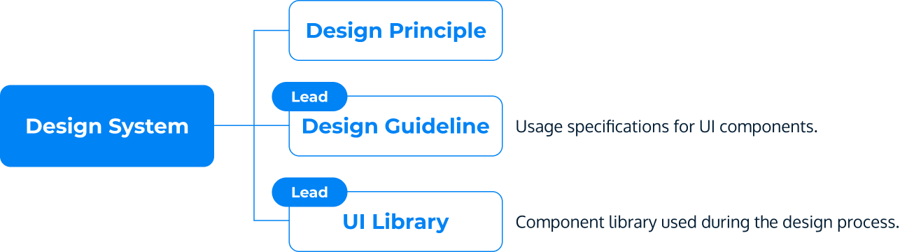
We prioritized the development of Design Principles, Design Guidelines, and finally, the UI Library, based on the level and the importance. Throughout the development of the Design System, we continuously collected feedback and made adjustments to ensure these components were seamlessly integrated into our workflow.
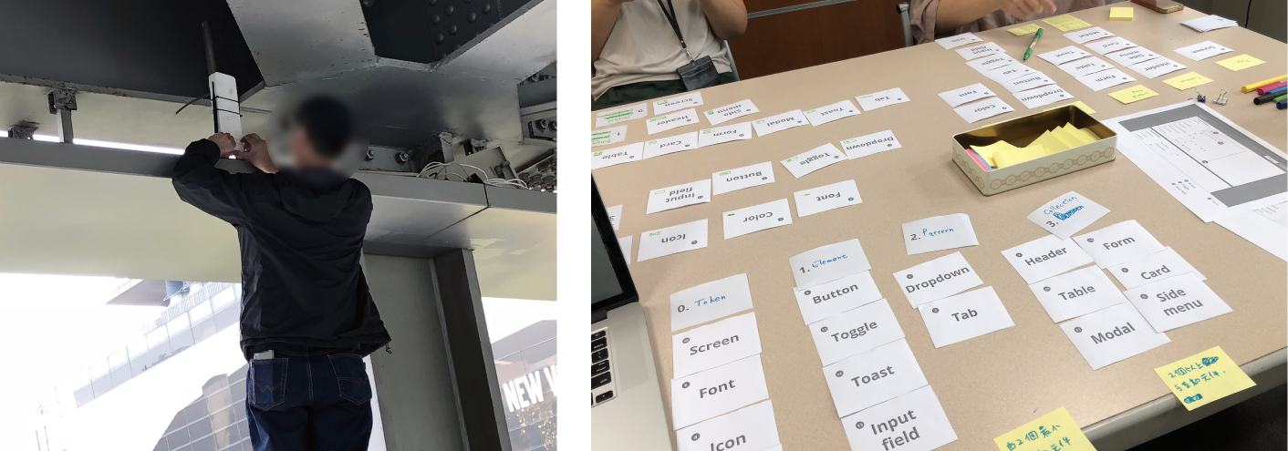
One of the main challenges I faced upon joining the team was finding ways to integrate and build trust. As a new member, establishing my role and gaining my colleagues' trust was crucial for effective teamwork. To address this challenge, I examined the skills of design team members, identifying key areas where the team was lacking, particularly in the design of guideline and UI component libraries.
Recognizing these gaps, I took the initiative to step in and address these needs, not only enhancing our team's overall skills but also showing my dedication and value. This approach helped me secure my place in the team and build the trust needed for our collective success.
By recognizing the team's needs, I strengthened my skills in these areas to fill the gaps in the team, thereby gaining the trust of my team members.
Another challenge I encountered was gaining buy-in from Product Owner for the UI library.
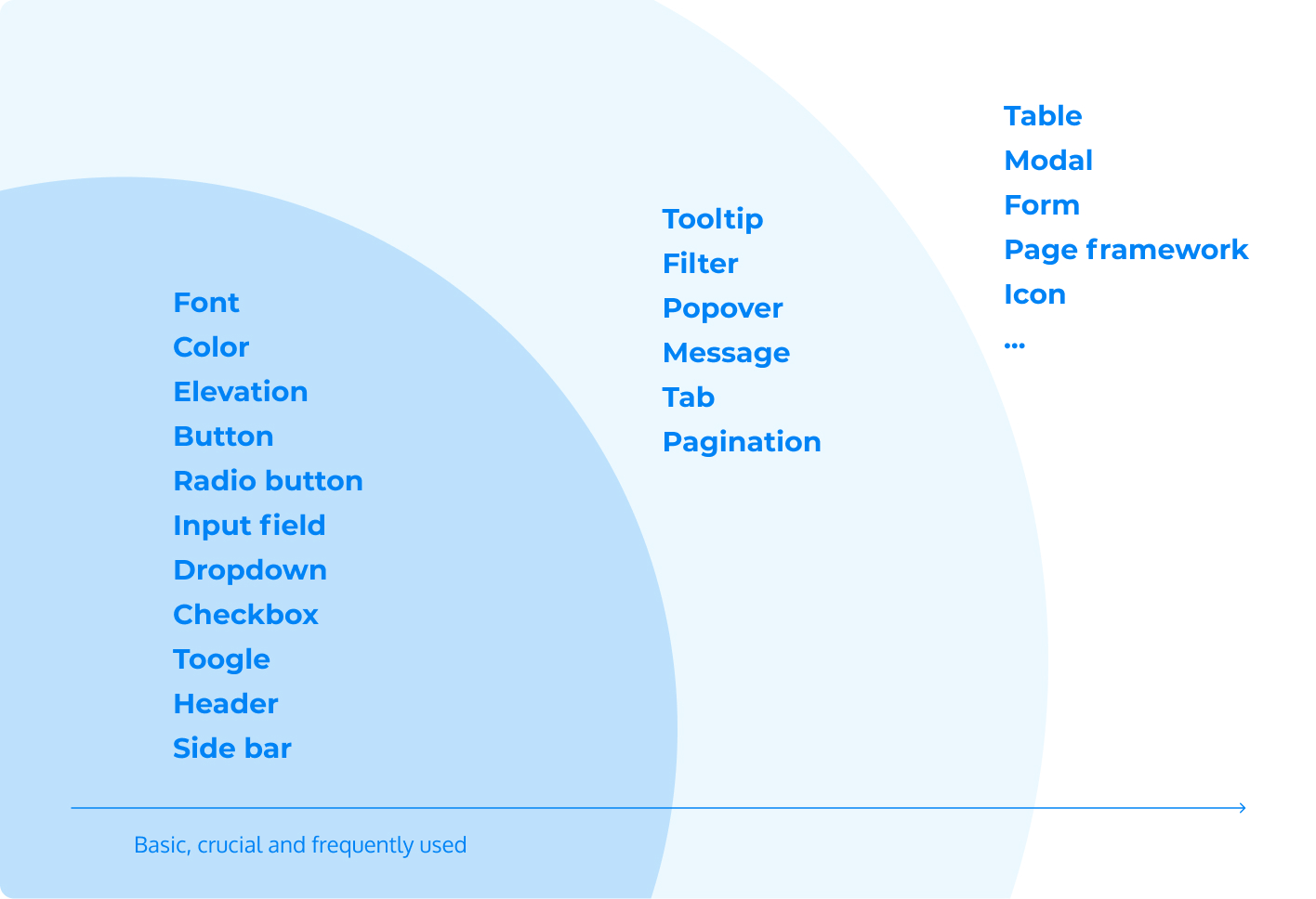
My resolution involved strategically planning the development of the UI library. I prioritized the implementation of the most basic, crucial and frequently used components, ensuring that this initiative did not hinder our existing design output. This phased approach allowed us to design components progressively, leading to the gradual completion of the UI library without disrupting the team's workflow. By demonstrating the practical benefits and efficiency of the UI library, I successfully garnered the necessary support and resources for this project.
The third challenge I faced involved the multitude of UI components used across various pages. The key issue was how to integrate these inconsistent components into a unified set that could cover all current usage scenarios on different pages.
To address this, I adopted the principles of atomic design. This process involved inventorying the pages where each component appeared, analyzing their usage logic, and establishing a set of guidelines that could universally apply to all present pages.
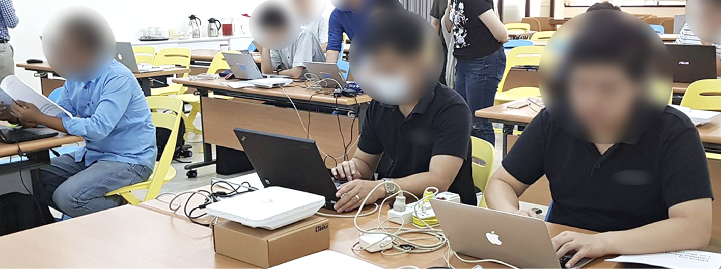
Furthermore, I conducted internal workshops to create the UI library tailored to our specific needs. This library was rolled out and iterated upon in a phased manner, ensuring a consistent and efficient integration of UI elements across the platform.
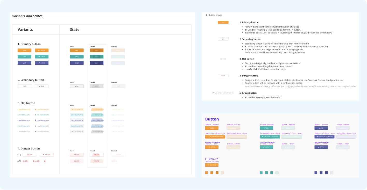
I use "Table" here to present the process.
1. List all current tables, analyzed their usage and elements.
2. Defined each element usage.
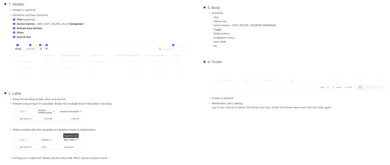
3. Apply guideline to table design.
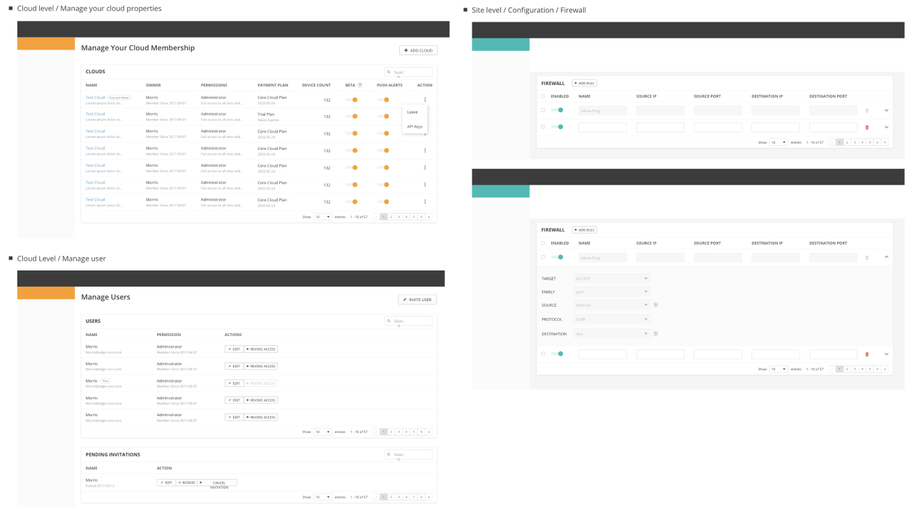
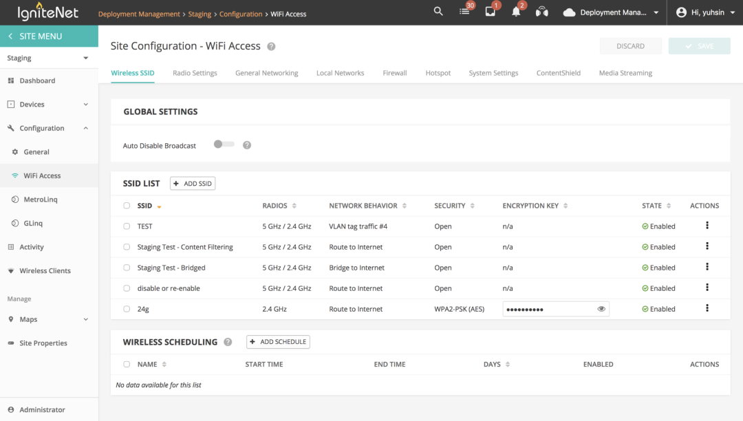
We designed guidelines for more than 20 elements, such as colors, fonts, input fields, and tables. These guidelines clearly define usage scenarios, UI variations, and interaction to ensure consistency among different designers when applying components to various contexts.
Furthermore, with the reusable UI Library, designers can now directly use components from the library, eliminating the need to communicate about the latest design versions, thus saving significant communication costs.
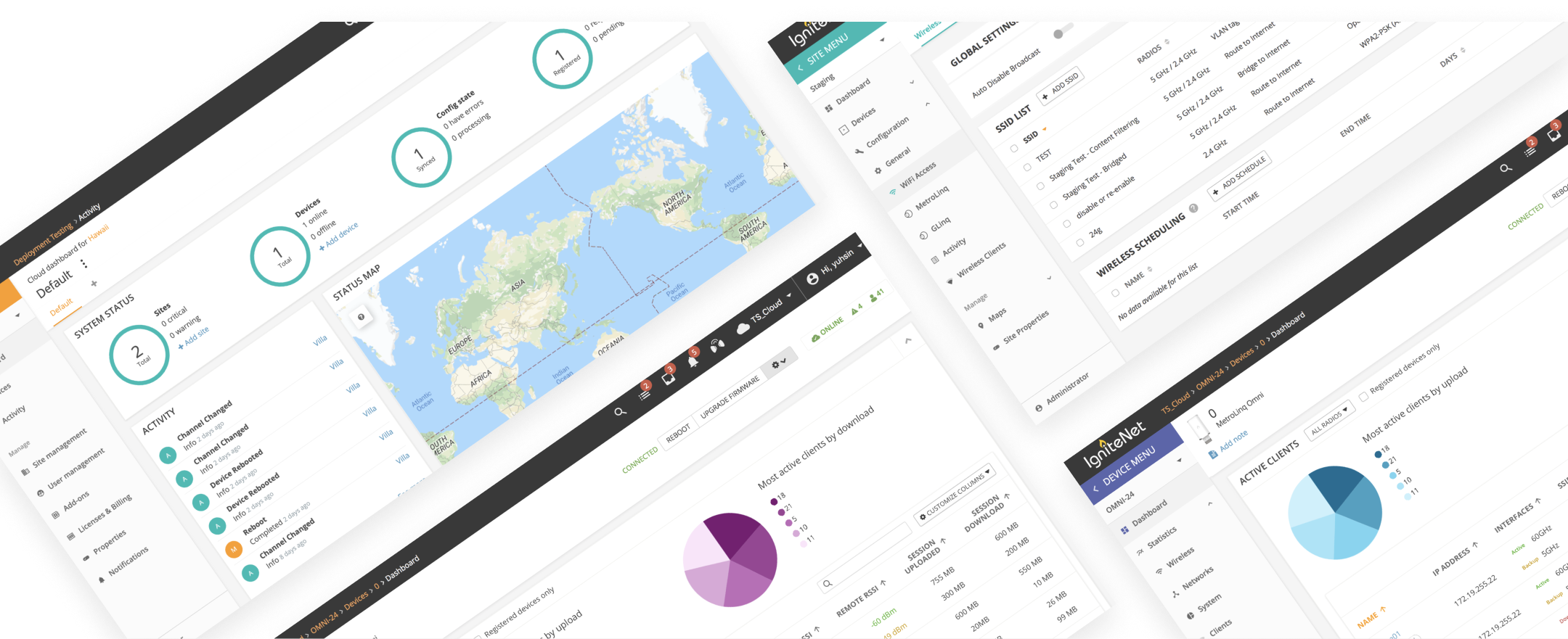
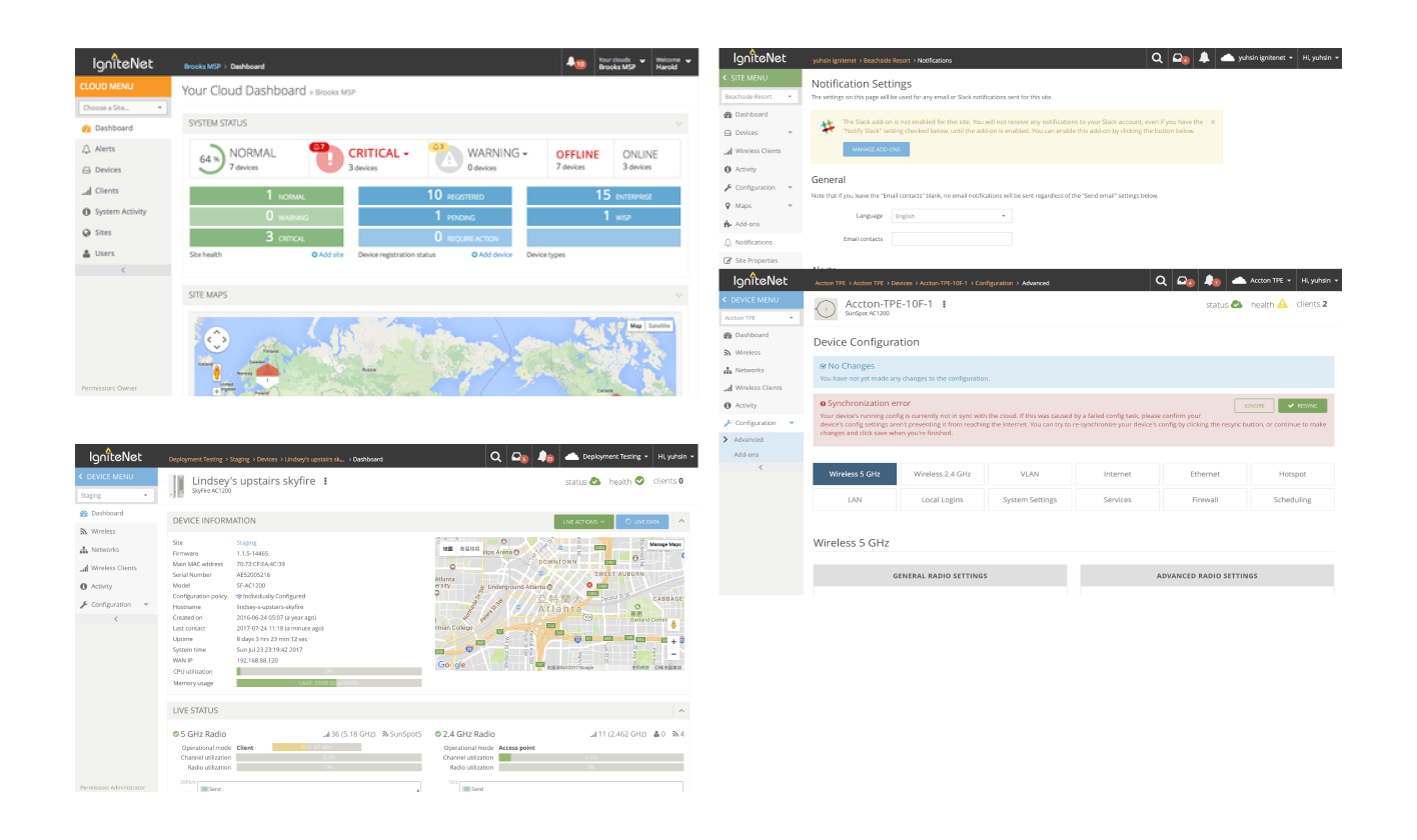
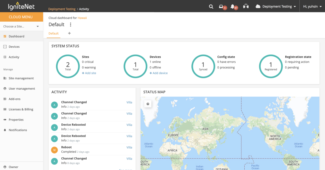
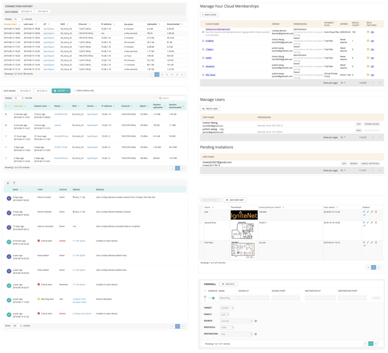
Part of Design Guideline and UI Library:
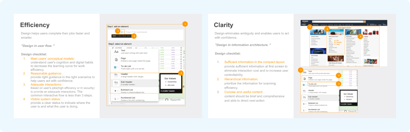
We defined 5 Design Principle: Efficiency, Clarity, Consistency, Accessibility, and Delightfulness. These principles include checklists and examples, providing the team with a clear direction to follow. This approach allows for a more comprehensive consideration of design integrity from various perspectives.
Part of Design Principle:
As the product continues to evolve, many new designs and interactions emerge. Including all these new designs in the design guidelines could lead to an overabundance of similar elements, resulting in guidelines that are overly complex and potentially redundant.
Consequently, the team has contemplated corresponding strategies: Design Reusability Consideration, Collaborative Design Justification Review and Guideline Integration Criteria.

Designers must consider why they are not utilizing already defined components from the Design Guideline when creating new elements.

During design review meetings, other designers will collectively review the rationale behind the creation of new elements to ensure their rationale.

If new elements are repeatedly used in different contexts, there should be a consideration to incorporate them into the Design Guideline and create the reusable components for them.


