Company
Role
Responsibility
Imweb
(Industry)
UI/UX design intern
Research - data tracking and analysis
Design - IA design, UI design
My responsibility was to redesign the landing page to increase conversion rates of registration and encourage more potential users to create their own sites and experience the product's value.
Because of time constraints and limited user research resources, I used data analysis tools such as Google Analytics and Hotjar to analyze the problems of the landing page, and worked closely with the product manager and marketing team to deliver the design.
This redesign project increased the overall conversion rate and reduced bounce rates with less marketing spending.

Imweb is a website-building platform that began expanding its market in Taiwan in 2020. In late 2022, the company adjusted the operation strategies. We had to increase the conversion rate with less marketing spending. Therefore, the landing page, the first touch point of new users, was the most critical item for improvement - such as the design needed to be consistent with the brand's style and the wording was strange for users requiring modification.

Before starting the redesign, I researched how users used landing page, what they wanted to know, and what frustration they encountered. However, because of the time constraints and limited user research resources, instead of recruiting users for interviewing, I used Hotjar, and Google Analytics(GA), conducted heuristics evaluation, and collected feedback from sales team for digging into the core problems.
Information

The pricing plan design violated human intuition - (1) The free plan was at right hand side that users can’t scan it quickly while the most expensive plan was at the left hand side. (2) There are 2 display ways of discount that confusing users.
Trustworthy
Usability

Increase user experience
Show product strengths
Communicate the brand spirit
Hero image

Key features

Design templates

Pricing plan

Users’ quotes

Footer

I tracked data by GA and found that the engagement rate increased, but the conversion rate decreased. After internal discussion, we decided to highlight more “0% revenue share,” one of the most different features from competitors.
Besides, we decided to show the monthly payment price instead of the yearly price. Though the annual pay price is lower, more new users buy the monthly payment plan. Displaying the monthly payment price is more user-friendly.
Furthermore, we reordered “Pricing Plan,” “Users’ quotes,” and “Design templates” sections. We hypothesized that if the plan attracted users, they would be more willing to scroll down to see more or click the CTA button.
Reorder the sections

Iterate the pricing plan section

After launching iterated design, the conversion rate increased, and the bounce rate decreased while the marketing spending was less than before. Overall, the users who came to the landing page became more willing to register accounts and create their sites to experience our product.

Before
After


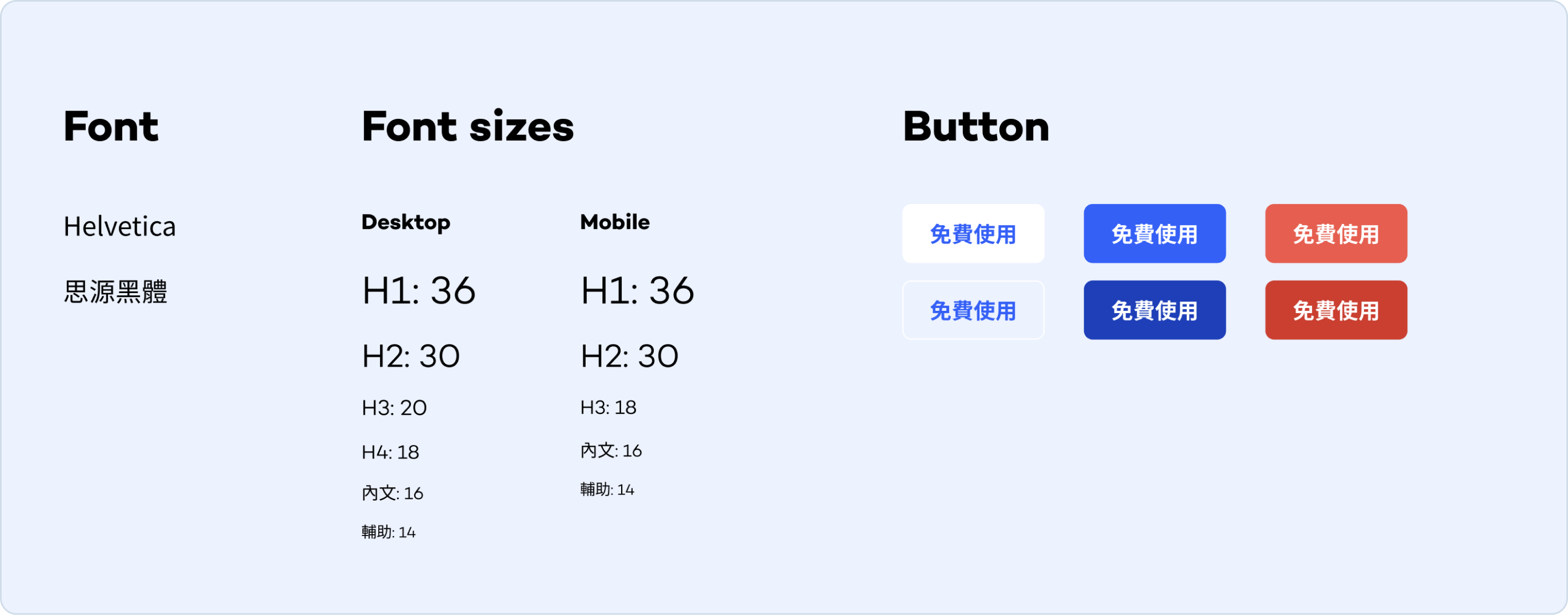
Design guideline